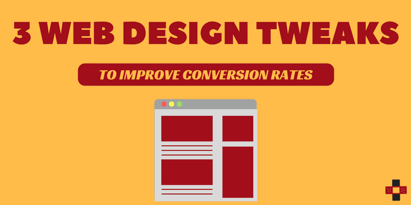
I’m sure you’ll agree – the benefits of great website design are many. This article will tell you three website design tweaks that will help you to improve your website conversion rate.
For one, it helps improve your company’s reputation. Some people hire web designers to improve their website looks and speed to get a better conversion rate.
Of course, speed also plays an important role when it comes to improving your website conversion rate. But here in this article, we are no much focused on the speed of the website rather we are more interested in website design tweaks.
Website design is important but hosting your website with SEO-friendly web hosting providers is also of vital importance.
In fact, 46.1% of people say a website’s design is the top distinguisher for whether they feel a company is credible or not according to Stanford University research.
Great website design also helps nurture and convert leads more efficiently. And when purchasing path on your website is defined, conversions come as autopilot.
Ultimately ensuring that no leads slip through the cracks.
But there’s a catch:
Great website design strategies can be so hard to execute.
That’s why I want to help you pick the right type of website design change for you.
So without further ado, let’s get into our first website design tweak…
3 Website Design Tweaks To Improve Website Conversion Rate
#1. Use Negative Space
If you’re already familiar with website design, you’ll know that whitespace is often referred to negative space by web designers. On the other hand, positive space refers to space containing other elements of style, like text.
What you must know is that negative space can be a good thing.
When it comes it comes to your website’s design, a lack of negative space can make content unreadable and therefore, rendered useless by visitors.
That’s why negative space is everywhere. From the larger spaces on the page to the spaces between lines of text, it all requires thought.
There’s no magical formula, but one tweak you can make to your website’s design is making sure all forms of negative space services keep your messaging consumable. This is important because people want to revisit websites that are easy on the eyes. And if your product/service has a longer buyer’s cycle, you’ll want revisits to increase the conversion rate.
For example, Spotify’s website uses a lot of negative space to drag focus to their key call to action–signing up.
Here are a few ways you can make the most of your negative space:
- The larger your font, the less space you’ll need between them to make them legible
- When in doubt, use the line height of 1.5 (Trust me, people find this idea to read!)
- Don’t forget to break up large blocks of text into smaller paragraphs like this article
- Add more space between important elements like your website banner, call to action and footer
#2. Remember the 8-second rule
Did you know? The average visitor to your website has about an 8-second attention span.
That means your potential buyer has a shorter attention span than goldfish.
Given this super short window to engage and convert, what can you do to make these 8 seconds count?
I’ve got some thoughts on website tweaks you can make to capture their attention within 8 seconds:
- Make your headline and/or call to action larger and shorter (Sometimes, less is more and to the point!)
- If there’s no imagery to supplement your call to action, add an image of your product/service to catch the eye of visitors
- Make sure your sign-up button is easy to find (I can’t tell you the number of time I’ve visited websites with tiny sign-up buttons at the corner of the homepage.)
- With that thought, use hover effects on sign-up buttons so it’s clear they can be clicked
- Use action words to make your call to action and copy more engaging
- If you already have great imagery of your product, try adding video and audio elements (Embedding with Youtube and Vimeo is easy to make the website more interactive.)
- As a last effort, add a pop-up to capture exiting visitors
#3. Find High-Quality Images
If you haven’t caught on already, having imagery is important.
But what’s more important is high-quality imagery that matches your content.
Not having high-quality imagery can really bring down your website design. And true to this statement, 60% of consumers have indicated a higher willingness to consider search results that include images, with 23% of consumers more likely to contact a business.
Unfortunately, stock images can often come across as boring and generic. We know for the fact that web content that includes compelling imagery drives 94% more views. That’s 94% more visitors that have the chance of converting.
With this in mind, I highly recommend sourcing high-quality photos relevant to your company brand. For instance, photos that capture people bring a human element to your website design.
You can source these photos from local events you attend, customers, and free stock photography sites–ideally a combination of these. The last thing you want is to come across as generic and corporate with no personality.
That said, don’t shy away from free stock photography. Here are some of my favorite places to look for high quality and FREE stock photography for website design:
Also Read,
- Make your website hackproof with the best WordPress security plugin
- WordPress Blog Tutorial – How to start a WordPress blog in 2018
- Best SEO friendly web hosting providers for your website
Conclusion
Regardless of your conversion goals, there will always be a website design to meet your needs.
Even if you don’t intend to make website design a large part of your marketing strategy, don’t forget it’s a great supplement that can help increase conversions on a product that might be on the back burner.
Let me know what website design strategies you are currently using. I’d love to know!
And which tweaks we talked about today apply to your current website design?
If you liked this article, then please subscribe to our YouTube Channel for WordPress video tutorials. You can also find us on Twitter and Facebook.
