Looking for tips to increase conversion rate on your website? A couple of years ago, I was the perfect blogging beginner. Bounce rates, drop-offs, exit rates, conversion rates, and such metrics were all foreign concepts to yours truly. I had no idea about launching a professional WordPress Blog.
In my head, writing post after post was all a blogger needed to do in order to rise to fame and make it big in the blogosphere.
As such, my content was a hit-or-miss affair in the early days. It was misguided, and just like any content without direction, it converted poorly.
When I came across the concept of conversion optimization, and have been experimenting with a couple of conversion strategies all while trying to put a finger on the stuff that yields big results.
Today, I want to share five conversion tips that have been working for me since I saw the light. All of these tips are easy to implement. You’ll be surprised it took you this long to find and put these strategies to good use for your WordPress blog.
Without wasting another second, let’s get right to it.
Tips To Increase Conversion Rates On Your Blog
Tip #1: Try Social Proof Instead of Talking About Yourself
You can talk about yourself all you want but it won’t get you favorable results as far as boosting conversion rates go. The customers don’t really care about you; they are on your site because there is something in it for them.
Sadly, you can make all the claims about your products or company being the best in the world, but your visitors will still go to your competitors if they don’t feel convinced.
Unless you show social proof, which is an effective persuasion tactic that has a direct correlation with higher conversion rates. So how do you turn the tables?
Social Media
Nothing builds social proof like community. – Jeremy Page, Using Social Proof to Increase Conversions, Crazy Egg
People want to stick with the group, and there’s scientific research to prove this. It’s just a psychological need to want to congregate in tribes. This is why you should look into creating positive connections with your customers using social media.
A good example of this tactic at work is MyThemeShop.
A prospect is more likely to bite your hook, line, and clincher if you can demonstrate a large group of people “like” or “follow” your brand.
According to Jeremy, “…something as simple as demonstrating how many “likes” you have from Facebook on your landing pages has been shown to increase conversions even when all other elements between competing sites remain the same.”
Logos
Do you partner with renowned brands? I’m talking about the kind of respectable brands everybody wants to associate with. Well, if that’s a yes, you can use their logos on your websites as social proof.
Do you serve customers that are well known in your niche? Putting their logos on your blog sends a strong signal to prospective customers that you’re worth your salt.

Good examples of companies taking advantage of this tactic include Voices.com and CookTravel.net among others.

Reviews
Did you know that 77% of customers read reviews before making a purchase online? Well, now you know. Reviews are an integral part of boosting conversions on many eCommerce sites.
Customer reviews, both positive and negative, show prospects that others have used your products, which builds brand trust – the one quality you need to get those carts filling faster than you can ship ’em.
Testimonials
A testimonial from an authority figure in your industry works like magic as far as increasing conversions go. Just make sure you don’t use generic testimonials as they can backfire.
Instead, use real testimonials that you have tailored towards your audience. Ask industry leaders to write you awesome testimonials after they’ve used your products/services.
If you don’t have any industry leader as an existing customer, get testimonials from your existing customer base, and then publish them on a prominent location on your site, preferably before your call to action. Video testimonials are better since they’re more believable.
Other social proof tactics to consider include case studies and media mentions. Try any of these tactics on your site and note the results.
Moving on…
Tip #2: Try Fewer Form Fields Instead of Asking for Too Many
Don’t we all hate filling forms? I know I do. I hate filling forms so much that Chrome’s autofill feature is my best friend. It’s one of my favorite tools for the browser. That aside, I do my best to shun all forms with many fields like the plague.
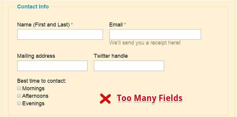
Every form field you ask your readers to fill increases the risk of turning the prospect away. That plus, we’re in the era of smartphones and a slew of other mobile devices. We all know typing, and more so filling in forms, on mobile devices is a chore.

Fewer fields will convert better, which should explain why the WordPress Subscribe plugin (pictured above) is a darling of many webmasters just like you.
The plugin is simple to set up and since it requires the visitors to fill in just the email field, it sees more conversions than, say, this:

Tip #3: Try Faster Load Times Instead of Making People Wait
Slow loading pages are bad business not only for user experience but also SEO. Now, everything that’s bad for user experience and SEO is definitely bad for your conversion rates, and ultimately your business.
Firstly, you’ll lose SEO points left, right, and center along with traffic – traffic that would have helped your conversion optimization efforts. Secondly, who do you think will stick around for a page that takes an eternity and a round trip to the sun to load? Nobody will.
What to do? First off, invest in super-fast WordPress hosting. Secondly, optimize your code and images for faster speeds. Thirdly, consider decreasing the perception of page load times using psychological tactics such as progress bars or keeping the user occupied while your content loads.
If you’re trying to get more users to convert into customers, ensure they have a great time on your site. Slow response time is not how you create an exciting user experience.
If you don’t do anything else, just invest in a professionally coded and ultra-fast theme such as Schema:
If you’re reading this tip, then it means my attempt at storytelling in the first paragraph paid off big time. See how I reeled you in with my own story? Okay, I will stop now, but I hope you get the point.
Well, stories lure readers, and the further down they read, the more likely they’ll stick all the way to the end.
Furthermore, storytelling is an art form that has been in use for centuries in different cultures. Passing down ideals and lessons becomes easier with storytelling as opposed to blurting out the lessons/facts.

Storytelling is the secret behind the success of long-form sales letters. That’s just because stories are fun, emotional and memorable. As such, try storytelling as opposed to listing out the information when creating your content.
You don’t even need to possess Hemingway’s writing chops; a simple story just needs a character, setting and a problematic situation.
Tip #5: Try the Responsive Layout Instead of Static Ones
A lot has been said and written about responsive web design that it should be a crime to release a static user interface (UI) to the world. I mean, responsive web design (RWD) is the feature.
Just look around, we’re in the era of mobile devices, which means smaller screens than we were formerly accustomed to. More people are accessing your site on mobile devices, and if you want to convert these visitors into customers, your site needs to look amazing and perform exceptionally well on the smaller screens.
Here’s where responsive web design comes in.
A responsive website degrades gracefully depending on the screen size, meaning mobile users will have as great a time as desktop users, and vice versa.
As a WordPress user, you should invest in a responsive WordPress theme such as the masterpieces offered at MyThemeShop. All the WordPress Templates offered by MyThemeShop are responsive. Yes, that includes the free WordPress themes too.
Are you with me? Are you having fun? Learning something new? If so, subscribe to our website to unlock a bonus tip that’s guaranteed to save you even more conversions.
Bonus Tip: Try Suggesting Continuity Instead of False Bottoms
A false bottom is what you’d call a visual lie, or giving the reader the perception that your page has come to an end when it really hasn’t. This causes the reader to abandon your page long before seeing your call to action.
If your page will scroll, establish a rhythm or a visual pattern that the reader can use to read further down. Avoid big and unnecessary gaps between sections or in areas where the fold appears.
You should place your most important content above the fold, and style the rest of your page accordingly in order to favor continuity.
Wrapping Up
Boosting your conversion rates is all about offering your visitors the best user experience possible. The time they spend on your site should be exciting and memorable.
All the above tips are easy to implement and can yield big results on your website.
We hope you’ll implement these strategies, and if you’d like to suggest a tip of your own, you’re very much welcome. Don’t hesitate to drop a line in the comment section below. See you around and all the best in your future endeavors!
If you liked this article, then please subscribe to our YouTube Channel for WordPress video tutorials. You can also find us on Twitter and Facebook


